Fix CI Badges size and other layout improvements - #255
Conversation


 jamoralp
changed the title
jamoralp
changed the title


There was a problem hiding this comment.
Looks fine to me.
However, the badge for CI is very short and the text is rather ugly shrinked.
Also the text of the other badges is squeezed and does not look very nice.
How about configuring the column width for those badge-columns to be large enough, that a normal badge icon would fit in?
Or adding empty spaces in the header row of the table - so that that badge columns have the same size?
Also (at least with my local jekyll server) I cannot click on rclc:Foxy release icon. Only if I zoom in very much, than the icon is click-able. Do you have the same problems, or does the link work for you?

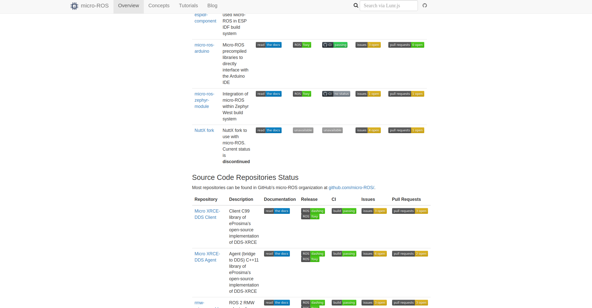
Well, this is what happens in the version that is currently uploaded to the webpage server: https://micro-ros.github.io/docs/overview/docker_ci_status/ However, in this branch, if I build the webpage on my laptop, then enter the link, it looks like this:
In my local generated page, the icon is clickable and looks ok IMO. Both |

|
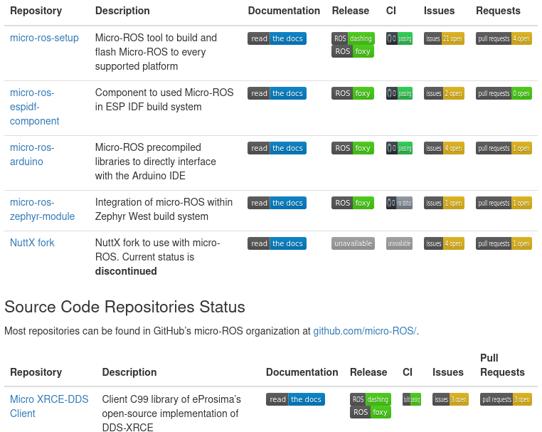
I just tested the branch locally with Jekyll: All badges have the same height now, but they are still squeezed so that the content becomes unreadable. Given the many white areas in each row, I still think that we should reduce the number of columns by putting some information (e.g., issues and PRs) in one cell vertically. Also, 5mm are lost just because of the column header "Documentation", which is wider than the read-the-docs badges. |
|
|

|
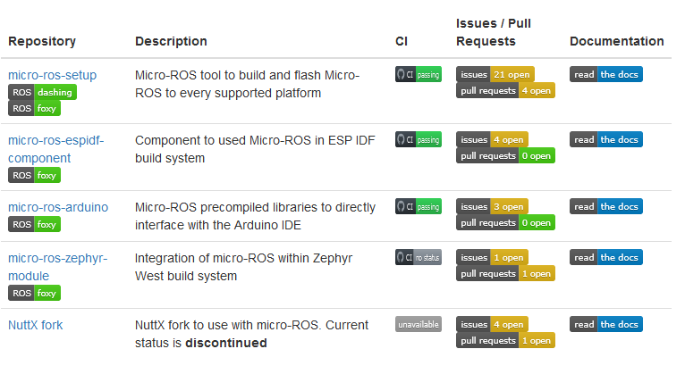
Some badges are still a bit squeezed, but it is much better now. Thank you!
The squeezing of the CI badges can probably be removed by simply replacing "CI" with "Continuous\n Integration" in the table header. |
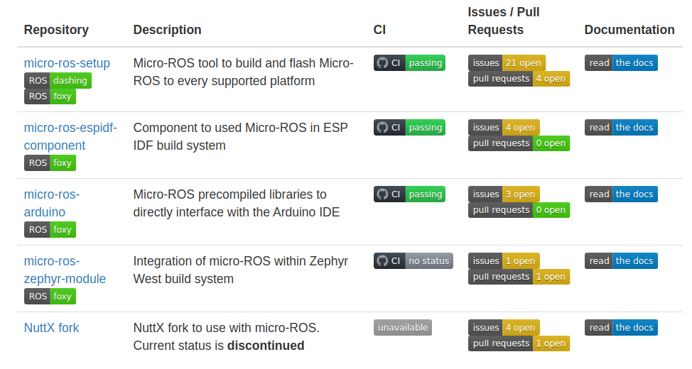
That is weird, and definitely not happening on my browser (Google Chrome on Linux Mint). Anyway, if the problem persist changing the title could be the solution, yes.
|
5 participants


TODO: